
Components
Link - Action
Use: DeployedExamples
Primary Entry
View va-link-action primary entry in Storybook
 View va-link-action primary entry in Storybook
Primary
View va-link-action primary in Storybook
Secondary
View va-link-action secondary in Storybook
Reverse
View va-link-action reverse in Storybook
Usage
When to use an Action Link
The action link is an eye-catching link to start a digital service. An action link entices users to take action. Example: Starting a benefit application.
- Primary entry is for entry points to an application. The Link - Action - Primary entry variation was added to stand out within text-heavy pages and to be distinct from a button, yet have a similar visual weight to a button for emphasis. Use the Primary entry variation to start an application. Current examples include the Form Upload tool and form-based applications. This variation replaces the Link - Action - Primary (green) variation which had been used for this purpose. Use only one Link - Action - Primary entry per page.
- Primary calls to action. A Link - Action - Primary (green) can be used for the primary call to action on a page. A Primary entry variation is preferred, but the Primary variation is allowed. Use only one Link - Action - Primary per page.
- Use the secondary variation for additional important links. Use the Link - Action - Secondary (blue) variation when there are multiple Action Links on a page or if the actions are of equal hierarchy.
- Use the Link - Action - Reverse (white) variation for a dark background. The reverse variation exists to meet contrast on dark backgrounds. This variation is used sparingly.
- Primary and secondary can go on the same page. Link - Action - Primary (green) and Link - Action - Secondary (blue) instances can exist on the same page, but we don’t recommend placing them side by side.
When to consider something else
- Use buttons for authentication actions. Don’t use Link - Action for these actions: “sign up,” “submit” or “sign out.” For these actions, use buttons instead.
- Use a button for going to the next step in a form. Use Button - Primary for moving between steps of an online application or tool. This is considered an action rather than navigation. Note that we prefer a Back link for navigation backward in a flow but have instances of using a Button - Secondary in most forms.
- Don’t use Link - Action for non-actions. Link - Action is not meant to replace all links. It should be used explicitly for actions.
Content considerations
- Keep Link - Action content short. Start with a verb. For example: “Apply for health care benefits” or “Register for care”
- Refer to the Content Style Guide on Links.
Accessibility considerations
- Purpose and target. Link text that doesn’t indicate a clear purpose or destination makes it harder for everyone–especially screen reader users–to understand where they’re getting routed off to.
- External links must indicate that they are external. Follow the methods detailed in linking to external sites.
- By default, the link component’s external link variation will append the text, “(opens in a new tab)”, instead of using an icon. This follows Techniques for WCAG 2.0 advice on providing users with both a spoken and visual warning that this link opens in a new tab.
Choose the right element: Buttons vs. links
Many people struggle to select the right element when choosing between a button or link. Making the right choice can help make an interface easier to use, especially for people who use assistive technology. Buttons and links are the primary ways users interact with information on a web page. Links are for navigation; buttons are for action.
Accessibility problem being solved
In general, make links look like links and buttons look like buttons. Designing buttons as buttons and links as links improves usability and accessibility by:
- Setting honest expectations of interaction behavior
- Providing clear signifiers of affordances
- Creating experiences that are consistent with web standards
Assistive technology users rely on proper semantics to access web content. They may choose to navigate by button, or link, depending on what they’re looking for. It’s vital that our content meets users’ expectations - link items, coded as buttons, could make those links hard to find, for example.
Button and link confusion can be very frustrating for assistive technology users. A user with a screen reader may pull up a list of links and may not find a specific link because it turns out that it’s been designated as a button in the markup. It is important to use Action Links for calls to actions that link to another page rather than buttons, because screen readers always say “link” before links, and “button” before buttons.
Ideal state
Buttons are:
- Used for actions, including:
- Submitting a form
- Opening a modal
- Changing the state of something (such as “Back / Continue” buttons on a form)
- Expanding something (like an accordion)
- Created using the Button component or Button group component, or with standard semantic HTML button
- Styled to look like buttons and shouldn’t include link signifiers, such as underlines
Links are:
- Used for navigation:
- Navigation bars
- Skip links / jump links (such as the On this page component)
- Links to internal web pages
- Links to external websites (read the Content style guide for additional information)
- Links to PDFs, whether static or generated on the fly
- Rationale: The final product is a file, and the Veteran may not know that the PDF is generated on the fly.
- Exception: If the trigger to generate the PDF is “Generate PDF,” “Create PDF,” or other phrases that explicitly call out the “action” nature of the generation, use a button.
- Created using the Link component, the Action link component if you need extra visual emphasis, or with standard semantic HTML link
- When a file download is involved, it is best to use the download link component. This is because links are intended for navigation, and downloading a file is a navigational action to a resource.
- Styled to look like links and shouldn’t include button signifiers, such as borders
Implementation notes
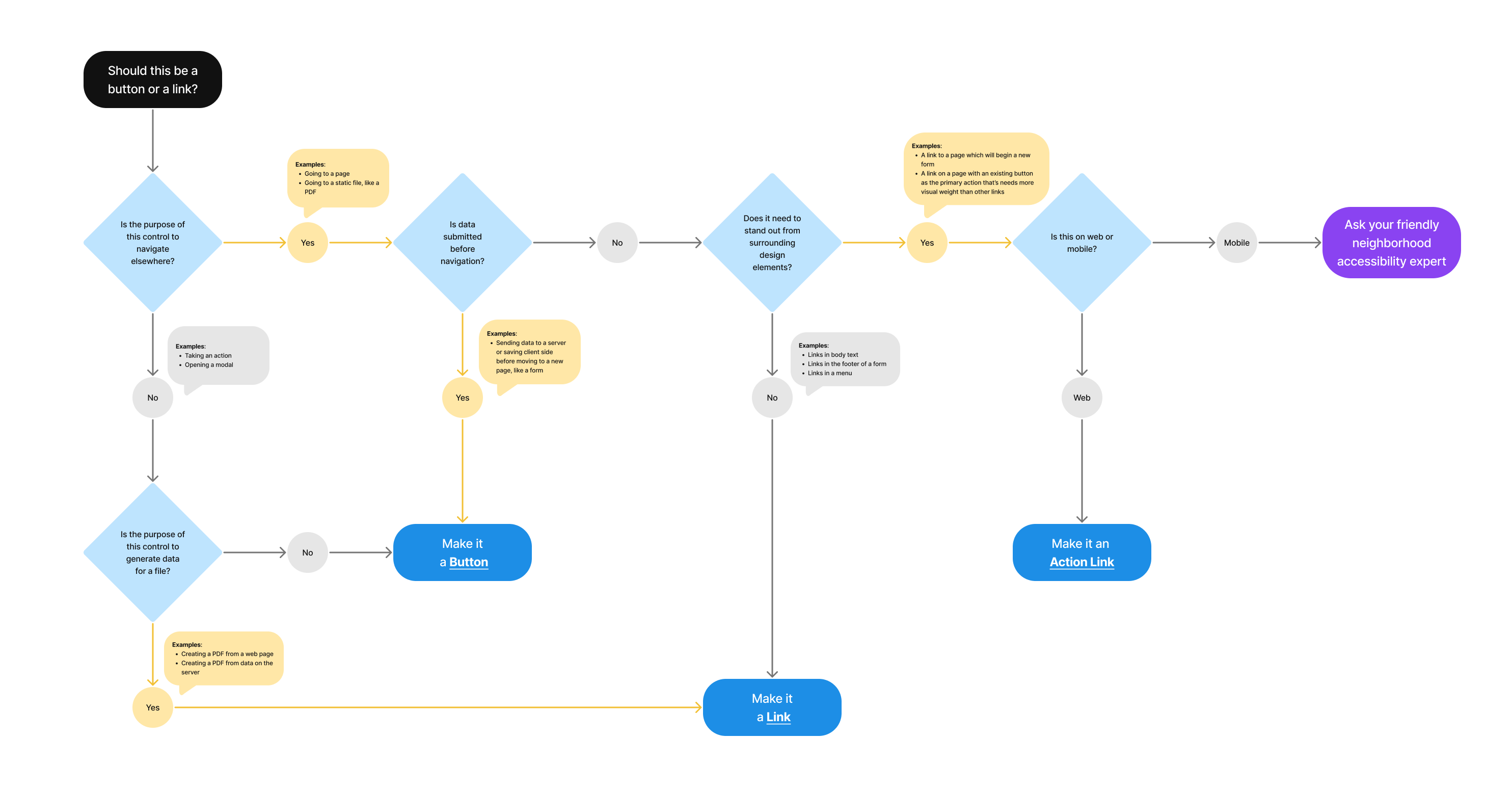
Should this be a button or link?
- Is the purpose of the control to navigate elsewhere?
- Yes
- Examples: Going to a page; Going to a static file, like a PDF
- Is data submitted before navigation?
- Yes
- Examples: Sending data to a server or saving client side before moving to a new page, like a form
- Make it a Button
- No
- Does it need to stand out from surrounding design elements?
- No
- Examples: Link in body text; Link in the footer of a form; Links in a menu
- Make it a Link
- Yes
- Examples: A link to a page which will begin a new form; A link on a page with an existing button as the primary action that’s needs more visual weight than other links
- Is this on web or mobile?
- Mobile
- Ask your friendly neighborhood accessibility expert
- Web
- Make it an Action Link
- Mobile
- Is this on web or mobile?
- Examples: A link to a page which will begin a new form; A link on a page with an existing button as the primary action that’s needs more visual weight than other links
- No
- Does it need to stand out from surrounding design elements?
- Yes
- No
- Is the purpose of this control to generate data for a file?
- Examples: Creating a PDF from a web page; Creating a PDF from data on the server
- Yes
- Make it a Link
- No
- Make it a Button
- Is the purpose of this control to generate data for a file?
- Yes
Privacy guidance
Links shouldn’t include Personally Identifiable Information (PII) or Protected Health Information (PHI).
- This includes the link text as well as the URL referenced in the link
Learn more on the URLs component page - If the link text must include PII/PHI, click events for that link can’t be tracked in analytics or other logs
Learn more on the Links page in the content style guide
Learn more about PII/PHI on the VA Platform website.
File downloads
- No PII/PHI can be in the names of downloaded files except for the user’s name and download date
- Include a reminder to delete files on a public computer