Components
List
Use: Deployed
A list organizes information into discrete sequential sections.
Examples
Default
Simple unordered and ordered lists
- Unordered list item
- Unordered list item
- Unordered list item
- Ordered list item
- Ordered list item
- Ordered list item
- Definition list title one
- Definition list item
- Definition list item
- Definition list title two
- Definition list item
- Definition list item
More complex unordered and ordered lists
-
July 10, 2023 letter
Board Of Appeals Decision Letter -
July 7, 2023 letter
Board Of Appeals Decision Letter
Usage
Additional guidance for VA
Choosing between variations
- Use unordered lists when the order of the items is not relevant. List items in unordered lists can be in any order and are indicated with a black square.
- Use ordered lists for sequential information. Ordered lists are automatically enumerated by the browser.
- Use description lists for groups of related terms and descriptions. List items parts in definition lists will be connected programmatically.
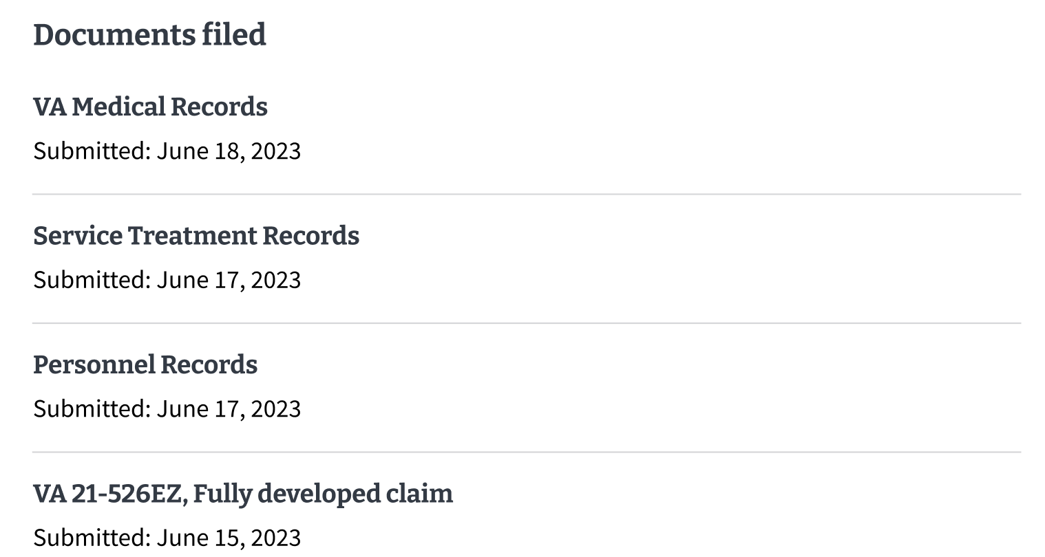
Instances of this component in production
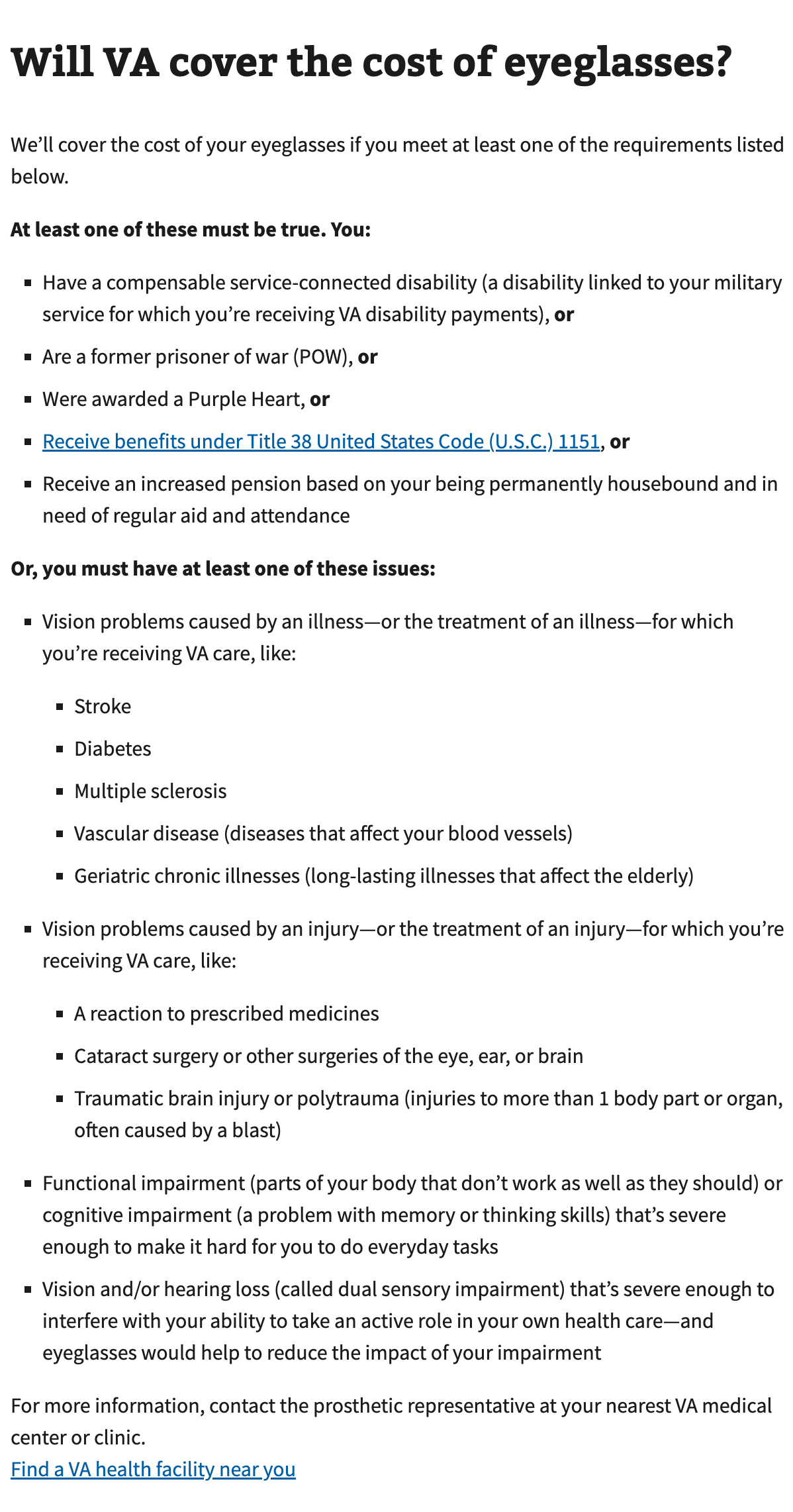
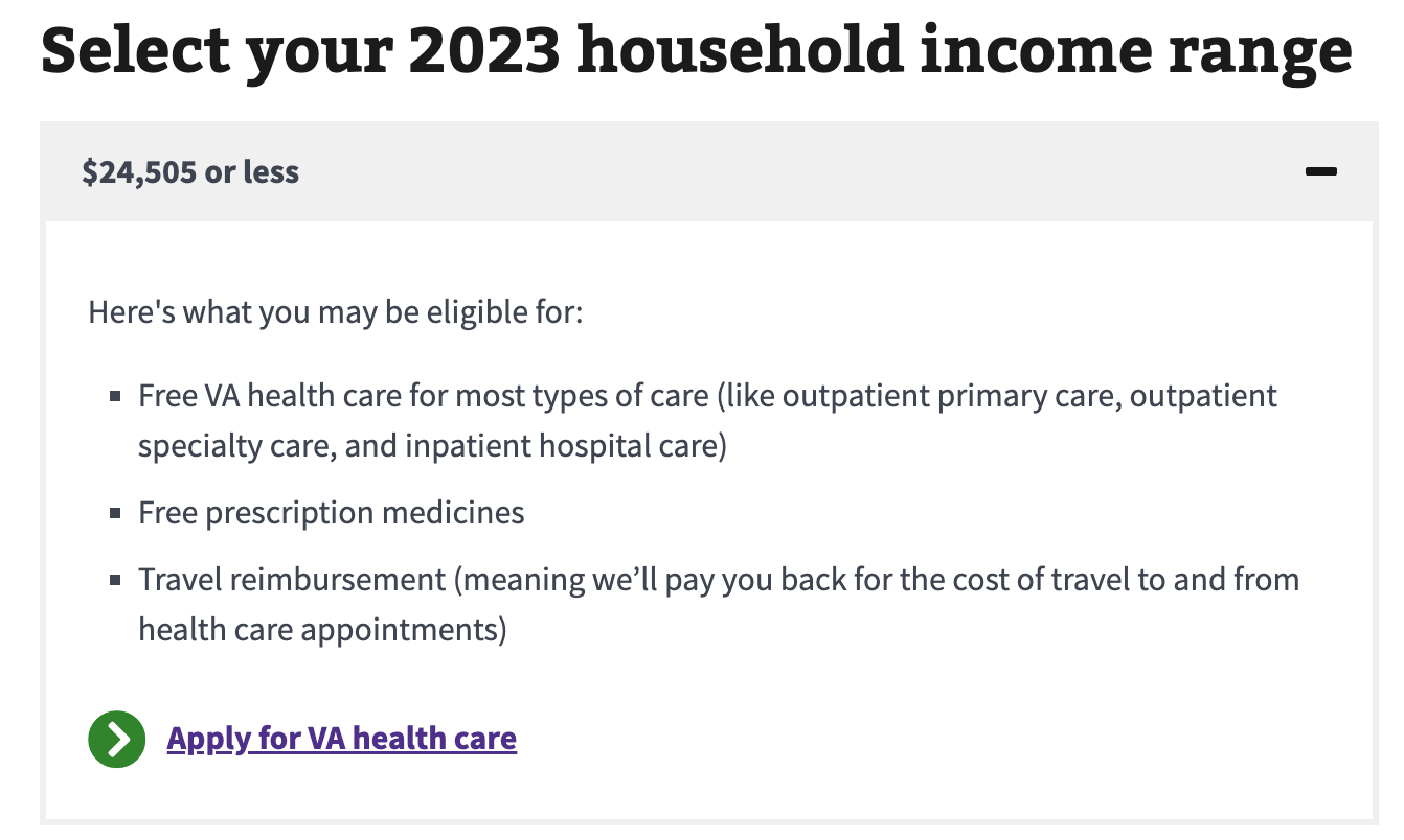

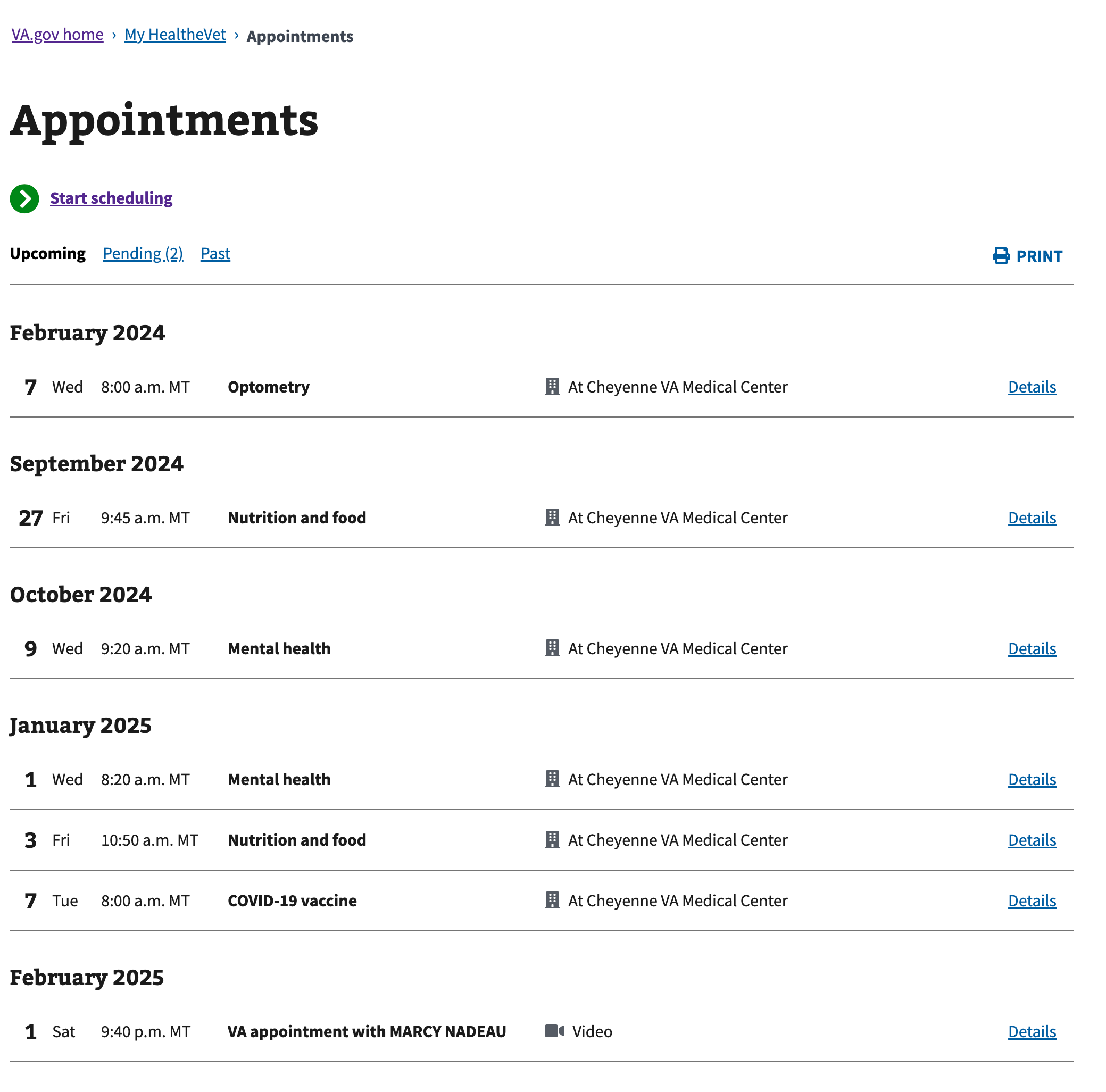
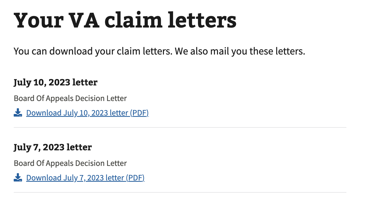
Content considerations
- Select the list type. Use numbered (also called “ordered”) lists when giving steps that someone must follow in a specific order. Use bulleted (also called “unordered”) lists for any list that doesn’t require a specific order.
- Introduce the list. Introduce the list with a full sentence. Avoid using “the following” in the list introduction and use a less formal phrase instead. For example, instead of “You’ll need the following documents,” use “You’ll need these documents.”
- Don’t combine the list items’ starting word or phrase with the introduction. For example, don’t introduce the list with “All of these must be true. You’re:” In this case, each item should start with “You’re.” This helps when the content needs to be translated into another language.
- No single item lists. Don’t use a numbered or bulleted list for only one item.
- Avoid using sub-bullets. Sub-bullets can make the content harder to scan. If possible, make the item with sub-bullets a separate list.
Note: Bulleted lists can be used in step-by-step lists. - Item content must be succinct. Keep each item succinct for scannability (for example, 1 or 2 sentences each).
- Connect items appropriately. When using “and” or “or” at the end of each list item, use a comma and bold the “and” or “or” at the end of each item.
Note: Don’t use “and/or” in lists. Instead, restructure the content to list all options (for example, “your income and/or net worth” should be “your income, your net worth, or both”). - No more than 7 items without a break. If your list has more than 7 items, use subheads to break out the list into smaller lists.
- Use parallel construction within a list. Each list item should be consistent. For example, starting with a verb or noun phrase.
Accessibility considerations
- Unique headings and link text. For complex list items that are comprised of more than one line of content (e.g. header, description, link, etc.) ensure that any headings and link text within the list are unique.
Related
Component checklist
Maturity
-
Guidance - Examples, usage, code usage, content considerations, and accessibility considerations are all complete.
-
Research - VFS team conducted research on this component which is linked from this page.
-
Stability - Component has been in production for more than 3 months with no significant issues found.
-
Adoption - Multiple teams have adopted this component.
Accessibility
While this component has been previously tested against older criteria, it has not yet been audited with the updated testing criteria.
Code assets
-
Variations - Storybook includes all variations (style, size, orientation, optional iconography, selection, error state, etc.)
-
Responsive - Component depicted in all responsive breakpoints.
-
Interactive states - Includes all interactive states that are applicable (hover, active, focus, keyboard focus, disabled).
-
Tokens - All design attributes (color, typography, layout, etc.) are available as tokens.
-
Internationalization - Describes i18n attributes.
Visual assets
-
Variations - Figma library includes all variations (style, size, orientation, optional iconography, selection, error state, etc.)
-
Responsive - Component designed to work in all responsive breakpoints.
-
Interactive states - Includes all interactive states that are applicable (hover, active, focus, keyboard focus, disabled).
-
Tokens - All design attributes (color, typography, layout, etc.) are available as tokens.
50% complete (5 of 10)
Legend:
-
Complete -
Incomplete -
Not applicable
Edit this page in GitHub
(Permissions required)
Last updated: Mar 28, 2025
