
Templates
Form Step - Minimal
Use with caution: AvailableAbout
This template is for all internal pages of a digitized form that asks Veterans to enter information, select an option, or upload supporting documents. The form page template uses the minimal header and footer components in a form flow. The header and footer are simpler and don’t show navigation elements. This frees up space on the page and allows the form submitter to focus on the task
We display the plain language form name in the minimal header without any heading structure. The plain language form name should match what is on the introduction page.
Use the H1 of the question page to describe the information needed or ask the specific question on the form page.
Examples
There are two versions of the form page template:
- Authenticated
- Unauthenticated
Example - Authenticated
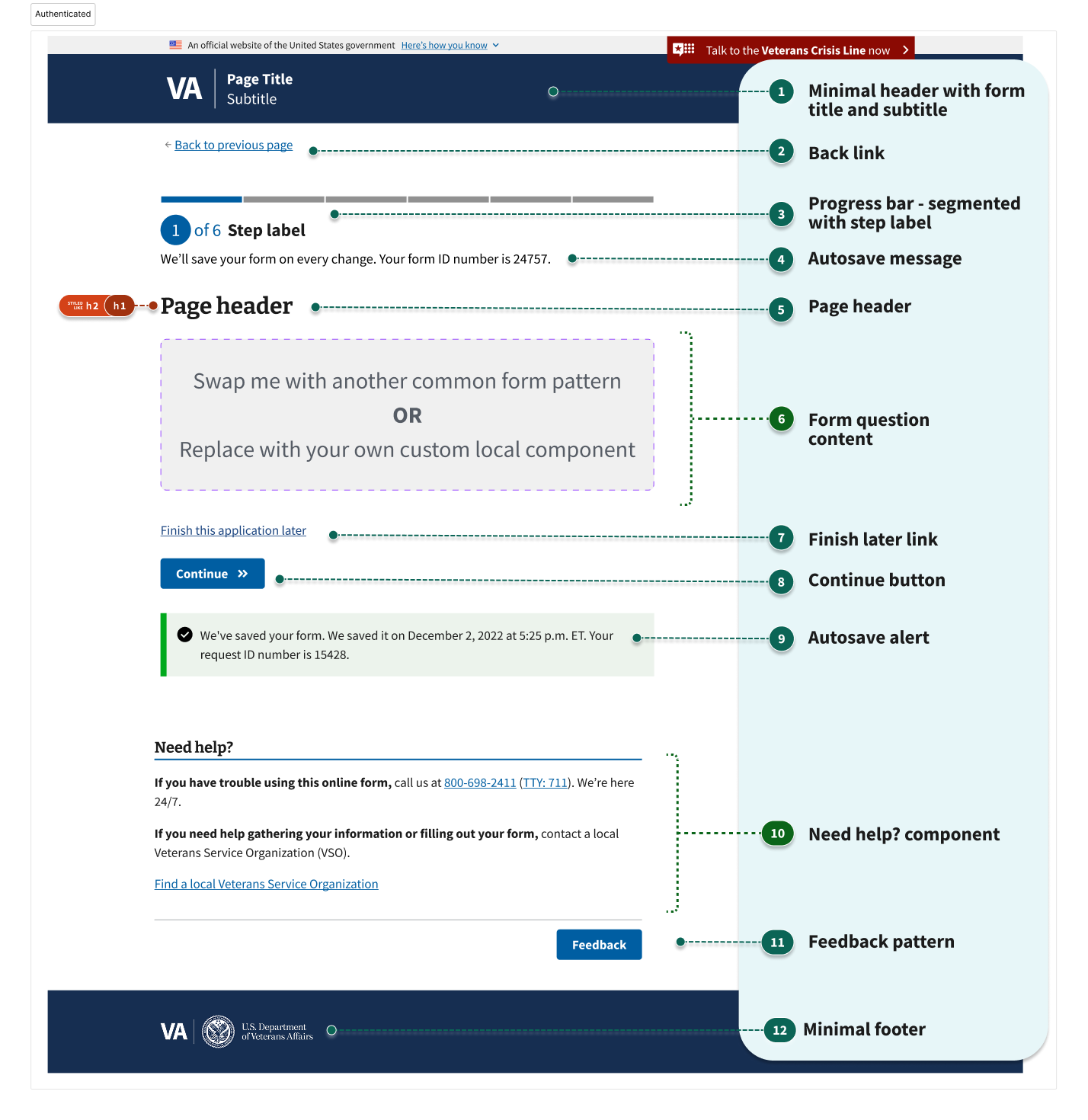
The authenticated form page template consists of:
- Minimal header with form title & subtitle
- Back link
- Progress bar - segmented with step label
- Autosave message
- Page header
- Form question content (may include page header)
- Finish later link
- Button (Continue)
- Autosave alert
- Need help? component
- Feedback pattern
- Minimal footer
Example - Unauthenticated
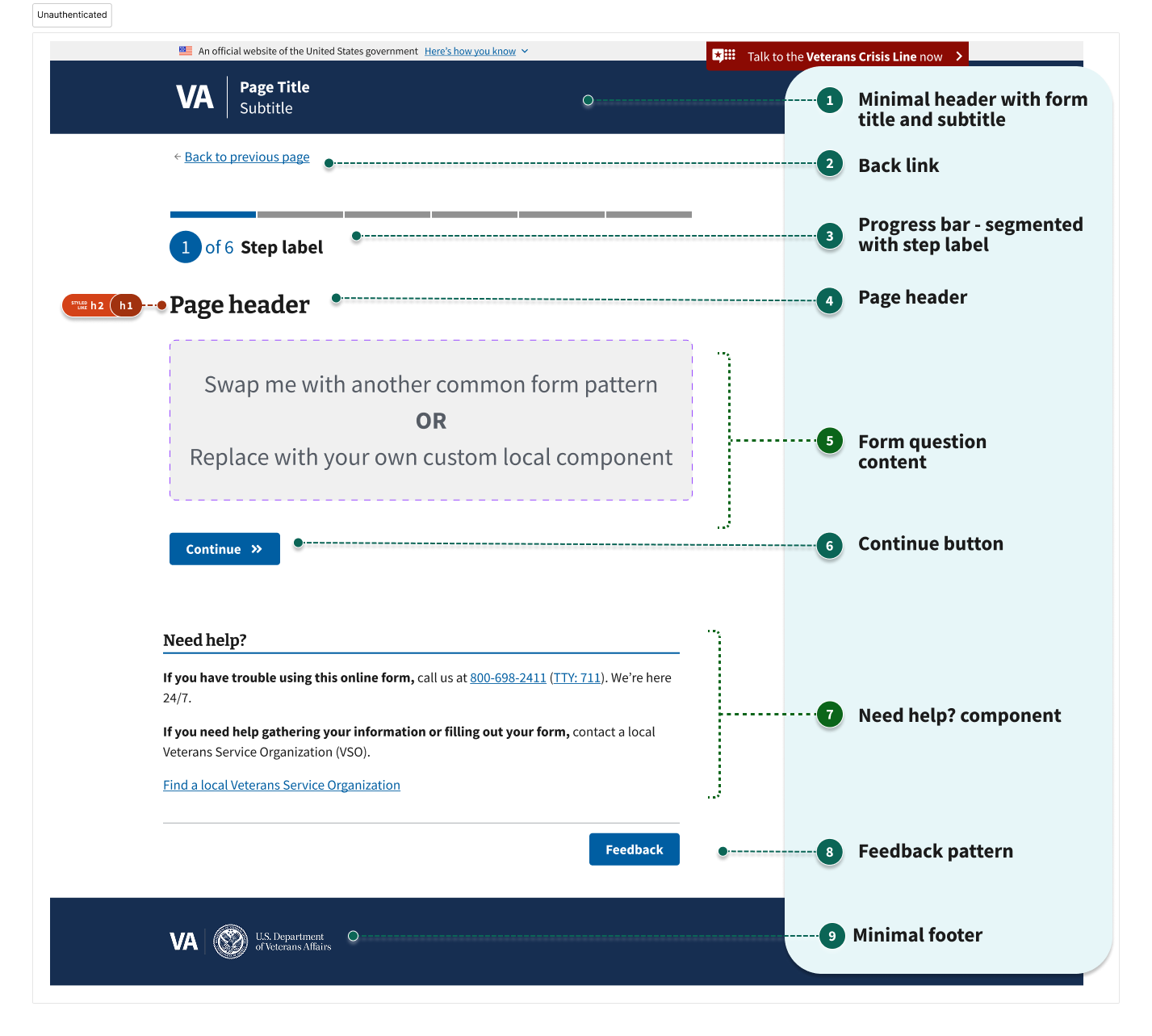
The unauthenticated question page has these items:
- Minimal header with form title & subtitle
- Back link
- Progress bar - segmented with step label
- Page header
- Form question content (may include page header)
- Button (Continue)
- Need help? component
- Feedback pattern
- Minimal footer
Usage
When to use this template
All new forms should use this template. The templates in Figma and in code provide good starting points for new form development. Your forms will have unique <H1>’s and be more accessible for users.
When to consider something else
Teams who want to migrate existing forms to this new template will gain advantages by having unique <H1>’s for every form page. However, it can be quite a considerable time investment because nearly every page in a form flow would need to be edited. If forms have already included <H3>’s on every form page, the lift will not be as large.
Instances of this template in production
Request personal records (VA Form 20-10206)
Structure
1. Minimal header with form title and subtitle
The form step template and the review page template uses the minimal header component.
Use the same plain language form title and subtitle as the form introduction and confirmation pages.
Review the form introduction template for guidance and examples of a form title and subtitle.
The form title and subtitle are in the minimal header without any semantic heading structure.
2. Back link
Instead of a breadcrumb, we include a back link below the minimal header in this template. The back link remains consistent across all question pages within a single form. Its text should read “Back to previous page”.
Learn more about the expected behavior for the back link.
We use the back link to reassure users that they can go back and change previous answers.
The back link should not break the browser back button. And it should take users to the previous page they were on, in the state they last saw it.
Exception: If the form submitter completes an action that they can do only once, like submit the form, the browser back button should still navigate the user to the previous page, but the user should not be able to submit the form again.
3. Progress bar - segmented with step label
The segmented progress bar component updates users on their progress through a multistep process.
To help determine the number and labels of steps it is important to group fields and form questions logically. This may require you to figure out the form questions before determining the number and labels of form steps. Use the one thing per page design principle to determine how much form content to fit onto a single form page.
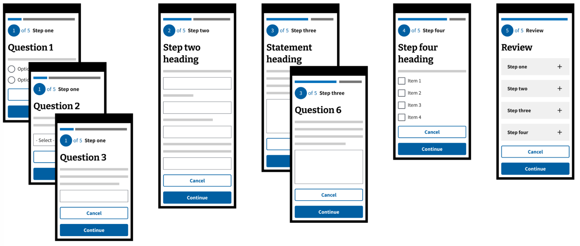
Each step within the progress bar is named with the “step label.” A step within a form could include multiple pages. However, because of the progress bar UI limitations, forms should be no more than 13 steps.
If there’s more than one question page in the step, the step label should be unique and distinct from the page header. The step label describes the general type of information you’re collecting (like “Your personal information”) and the page header will be specific (like “Your name and date of birth”). If there’s only one question page in the step, the step label and page header may be the same.
In the example below, we show that step one has three pages, step two has one page, step three has two pages, and step four has one page. The additional review page, makes this a five step form.
4. Autosave message
This text notifies authenticated users that we save their form automatically and provides an application ID number. This only appears on the first question page of a form.
5-6. Form page content
Organizing form questions
Keep in mind these 3 key guidelines for ordering and organizing form questions:
- The form itself may need a particular piece of information to determine other questions and flows later in the form. So make sure you ask for this information before you need it. For example, some forms use the date of birth component early in the form to determine whether or not to ask about age-related eligibility requirements later on.
- Front-load the form with questions that are easy for the form submitter to answer to help them get comfortable with the form experience and reduce the likelihood of abandonment.
- Users generally understand forms when the information is logically grouped. For example, if your form asks for information about dependents, group these questions together in the same step.
Learn more about the “One thing per page” design principle to determine how to organize your form questions. Following this principle helps users focus on a specific task without being overwhelmed.
Asking a question on a page does not mean using only one form field. We may add multiple fields on a question page to gather similar data we need. Don’t mistake the “one thing per page” principle as “one form field per page.” There may be times where it makes sense to group a number of related questions on the same page.
The VA Design system has a number of components and patterns available to teams that help you formulate good questions. These patterns are standardized to help give Veterans a unified experience throughout all of our forms.
- Ask users for… addresses
- Ask users for… dates
- Ask users for… email address
- Ask users for… names
- Ask users for… phone numbers
- Ask users for… relationship to Veteran
- Ask users for… signature
- Ask users for ssn
If you need a new component or pattern, you will need to follow the experimental design process.
Page headers
Page headers can be questions or statements.
Each question page in the form needs a unique H1 page header that tells the user what kind of information we’re asking for on that page.
Any of these can be the page header:
- The label on a text input or text area
- The legend of a group of fields
- The legend of a radio or checkbox group
- Standalone text coded as an
H1
For simple questions, the page header may be the only other text the user needs to answer the question. In those cases, the label or legend will usually be the page header.
For complex questions, you may need to use one of these options to provide additional explanation:
- A standalone
H1page header that gives general context before one or more specific labels or legends on the form inputs - Body text after the H1 page header (which can also serve as hint text for all fields on the page, and may include examples or bulleted lists)
- An additional info component
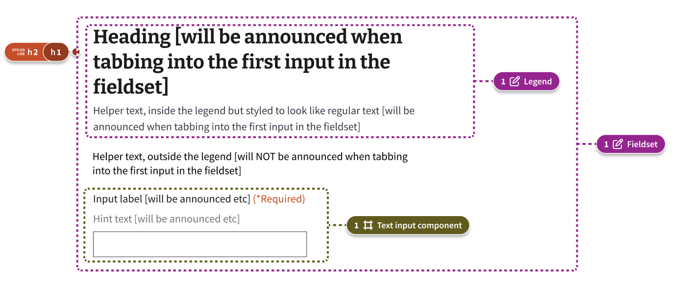
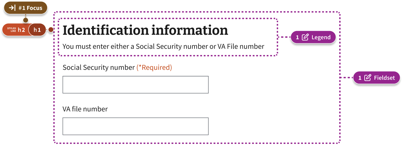
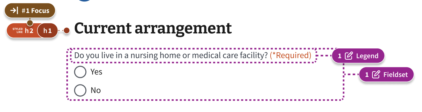
You can set the contents of a <legend> on the page as the page header (<H1>). But, you may not always need the h1 to be inside the legend.
Fieldsets & legends
A good approach for programmatically associating helper text is to put it into the legend and then styling it to look however you want it to look. For example, this screen shot shows a form question with a header (H1) and helper text inside of a legend. Then it shows additional text that a screen reader won’t read. Then, it displays the text input label, hint text, and field. This level of design and annotation ensures the most important things are available to screen readers and sighted users alike.
Learn more about fieldsets, legends, and labels
More examples
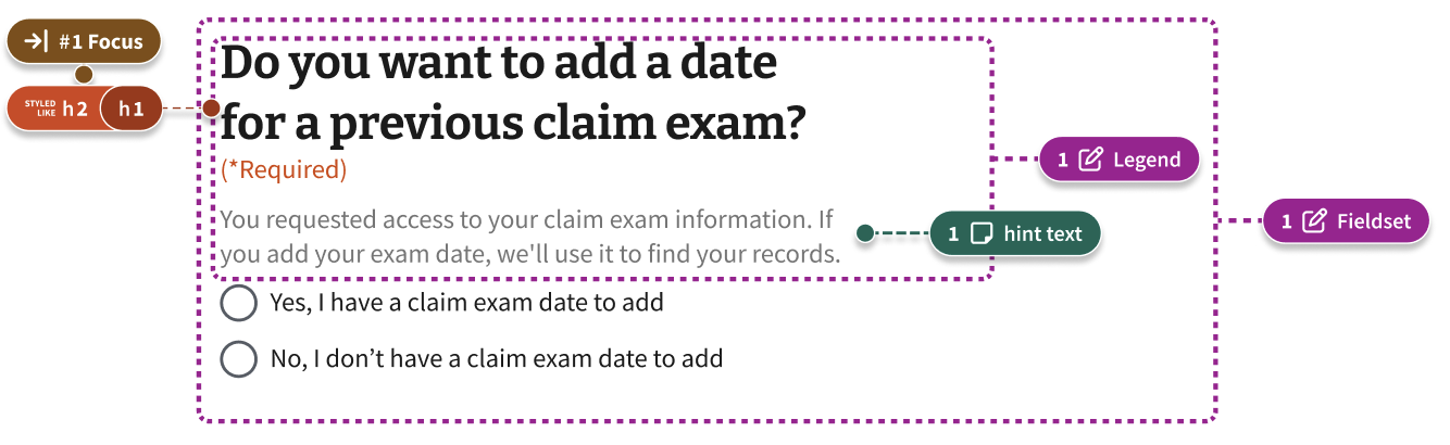
Hint text
Use hint text to show information that helps a majority of users answer the question. Information could include how their answer will be used or how they could find the answer.
Try to keep each hint text to a single short sentence without any line breaks. If you need to give a long detailed explanation, don’t use hint text. Screen readers will read the entire hint text aloud when users interact with the form field. This could frustrate users if the text is long.
Don’t use links in hint text.
Additional information
Use the additional information component if there’s relevant information that may be important for some people, but it’s not critical information for everyone filling out the form.
Review guidelines for using the additional information component.
7. Finish later link
This link allows the user to exit the process with their progress saved.
8. Continue button
On form pages, the button users select to proceed is labeled “Continue.”
9. Autosave component
In an authenticated experience, forms can be enabled to autosave on every on blur event. An on blur event is when a user interacts or moves away from a field. The Autosave component appears on the page after the first on blur event and displays the last saved date and time.
Learn more about the autosave component.
10. Need help?
The Need help? component appears on the bottom of every page of the form. This content tells users how to get additional help with the form or contact VA about their related benefits. You can customize the content for the specific form.
Learn more about the need help component.
11. Feedback pattern
The feedback pattern allows VA.gov to collect feedback from users via Medallia.
Learn more about the feedback pattern.
12. Minimal footer
The minimal footer component strips out all of the navigation found in the full footer that is found on other VA.gov pages. This helps users stay focused on the task at hand. The VA Seal is a link to VA.gov.
Learn more about the minimal footer component.
Research findings
This form page layout aims to address pain-points related to the amount of redundant or unnecessary content that is on each form. In recent studies, we’ve observed that:
- Some sighted Veterans are confused by repetitive content in forms as the
H1and step heading may repeat for several pages in a row, and take up a lot of visual space on the page. - Screen reader users are disorientated by repetitive
H1s as theH1is meant to be a unique description of the current page (not a summary of an overall flow e.g. a form title) - For Veterans with low vision who use magnification on mobile devices, questions can be hidden below “the fold” completely
Code considerations
Minimal header (minimal form flow) pattern documentation details how to implement this variation.